Scroll to read the featured post
The Journal
Featured
Wedding Planning Tips
Anniversaries
Editorial
Personal
Boudoir
Engagements
Weddings
Categories
Hello
Here you will find some of the celebrations, special occasions, and projects our team has been honored to document over the past 15 years.
I'm Meredith
based in savannah.
a heart for travel.
southern weddings
south magazine
new york times
southern living
munaluchi bride
i do destination
forbes
Where My Logo Came From | Classic Wedding Photographer
June 22, 2015
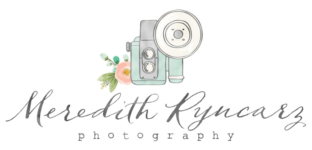
 I have been asked where my logo came from and I wanted to share the symbolism behind what may seem as just another pretty wedding photographer’s logo. When I updated my logo, I wanted to make sure that it wasn’t just pretty but that it had elements of me and things that I love in it. From the hand lettering to the color teal, all of the individual items were carefully included by my designer.
The Rose: Even when we dated, my husband would bring me flowers for no reason. We have been married for almost nine years now and he still does this, but what I love even more is that he is teaching our son the importance of small gestures like this. We believe love is found in the small and daily gestures that build up and span a lifetime together. One day it will become a sweet story that our son can tell to his son as he teaches him the art of buying flowers for his future wife. This particular rose is also planted at every home we have ever lived at in the nine years we have been married. As a family that moves every three years due to my husbands job, we have always left a little of our legacy behind.
The Camera: While I currently shoot with a DSLR, I started learning photography on a film camera and can sometimes get uber nostalgic about my college dark room. It is just one of the many vintage loves that comprise who I am.
Teal: Teal is one of my favorite colors. So much so that at one point my husband threatened to take my credit card away if I kept bringing home teal items to decorate with.
Hand lettering: The lettering in the logo was important to me as a handwritten note is always so precious and sweet in a day of e-mails and text messages. I still love getting snail mail.
For more of this series on Mondays with Meredith check out the original post here.
back to top
BRAND & WEB BY ASHLEY FERREIRA DESIGN
Copyright 2022 Meredith Ryncarz Photography LLC